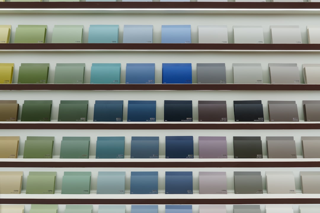
Valspar’s 2027 Color of the Year is a mid-depth blue with gray undertones that most designers would file under “transitional” — the kind of color that’s been quietly holding walls together in coastal and Nordic-influenced interiors for the better part of a decade without ever getting credit for it. Its formal name, as of our last check, is Gentle Tide, a muted, slightly chalky blue that reads warmer in incandescent light and cools down noticeably under daylight-balanced LEDs. That shift is worth understanding before you order a single sample pot.
The announcement matters less as trend news and more as a practical signal: when a major paint manufacturer designates a color, they’re also expanding its formula availability, promoting it across the contractor-facing side of the business, and making it easier to match in adjacent products — primers, accent colors, complementary grays. For a renovation project, that supply-chain detail is genuinely useful.
Why This Particular Blue Is Easy to Get Wrong
Gentle Tide belongs to a category of blues that sit right at the edge of perceptibility — colors where the human eye genuinely disagrees with itself depending on what’s next to the swatch. Hold it against a warm white and it reads blue-green. Put it beside a true gray and suddenly it looks almost purple. This is not a quirk specific to this color; it’s the nature of any blue that hovers in the 490–510 nanometer range with heavy gray and white saturation pulled in.
The practical consequence: don’t select this color from a 2×2 inch chip. Paint at least a 12×12 inch section directly on your wall, let it cure for 48 hours (not just dry — cure), and observe it at three different times of day. Morning north-facing light will show you its coolest face. Afternoon sun hitting a west wall will warm it considerably. Under a standard warm LED (around 2700K color temperature), it will shift toward something closer to a dusty slate.
Contractors who paint walls in a single pass and ask you to approve color on wet paint are asking you to approve the wrong color. Latex shifts 10–15% in value as it dries, and a blue with gray undertones will look noticeably lighter and more neutral once fully cured.
Where It Works — and the Room Conditions That Defeat It
The color performs well in rooms where you want presence without visual weight. Specifically:
- Living rooms with south or west exposure: The warmth of afternoon light prevents it from reading as cold or clinical
- Hallways and transitional spaces: Its neutrality means it connects rooms with different color temperatures without fighting either
- Cabinetry and built-ins: At a higher sheen (satin or semi-gloss), the gray undertones deepen and the color gains authority — this is the version that shows up in kitchens alongside raw wood or unlacquered brass hardware
Rooms where it struggles: small north-facing bathrooms, basements with no natural light, and any space lit primarily by cool white LEDs (4000K and above). In those conditions, Gentle Tide will read flat and slightly institutional. If you’re committed to the color but stuck with cool artificial light, you can correct somewhat by choosing a warmer-temperature bulb — our article on clip-on lights and task lighting covers the quick options if you’re working with flexible fixtures rather than hardwired cans.
Running the Math Before You Buy Paint
A color announcement from a major brand often comes with a promotional nudge toward full-room painting, but the honest cost question is whether this project warrants it. Single-room paint jobs — walls only, no ceiling, no trim — typically run anywhere from $200 to $600 in materials depending on room size, surface condition, and the number of coats required. (Verify those ranges locally; regional labor and material costs vary significantly.) Add primer if you’re covering a darker color or a previously glossy surface, which you almost certainly should.
If you’re approaching this as part of a larger renovation with real financing decisions attached, the choice between rolling costs into a credit line versus cash matters. We’ve looked at that tradeoff in the context of home improvement projects more broadly here.
The other variable most people skip: sheen selection. Valspar’s formula for Gentle Tide will behave differently across their sheen lineup, and the color reads measurably different at flat versus eggshell versus satin. For walls in high-traffic areas, eggshell is the practical baseline — flat finishes will show scuffs and can’t be wiped without marring the surface. For cabinetry applications specifically, go no lower than satin, and test the semi-gloss version before committing.
The Staging and Resale Consideration
Painting walls ahead of a sale in a color the market doesn’t recognize yet is a real risk. Gentle Tide is distinctive enough that a buyer who doesn’t like blue will notice it immediately — and neutral enough that buyers who do like it might not consciously register why the room feels right. That ambiguity is roughly the best-case scenario for a Color of the Year pick used in a home going to market.
If you’re preparing a space for listing and want the color’s light-expanding quality without the commitment, consider limiting it to a single accent wall, the interior of built-in shelving, or cabinetry rather than all four walls. The effect carries. The commitment shrinks. And as we’ve noted in examining how small spaces use color and proportion to read larger, the impact of a thoughtfully placed color is often disproportionate to the square footage it covers.
Your Next Step Before Ordering Paint
Request sample pots in at least two adjacent colors from Valspar’s palette — one cooler and one warmer than Gentle Tide — and paint all three in vertical stripes on your largest unobstructed wall. Live with them through a full weekend. Photograph them with your phone on auto-white-balance at different times of day and compare the images; the camera will record what your eye adjusts for in real time. That exercise, more than any swatch or color tool, will tell you whether this particular blue has actually been sitting in your overlooked range all along — or whether it looked better in the press materials.