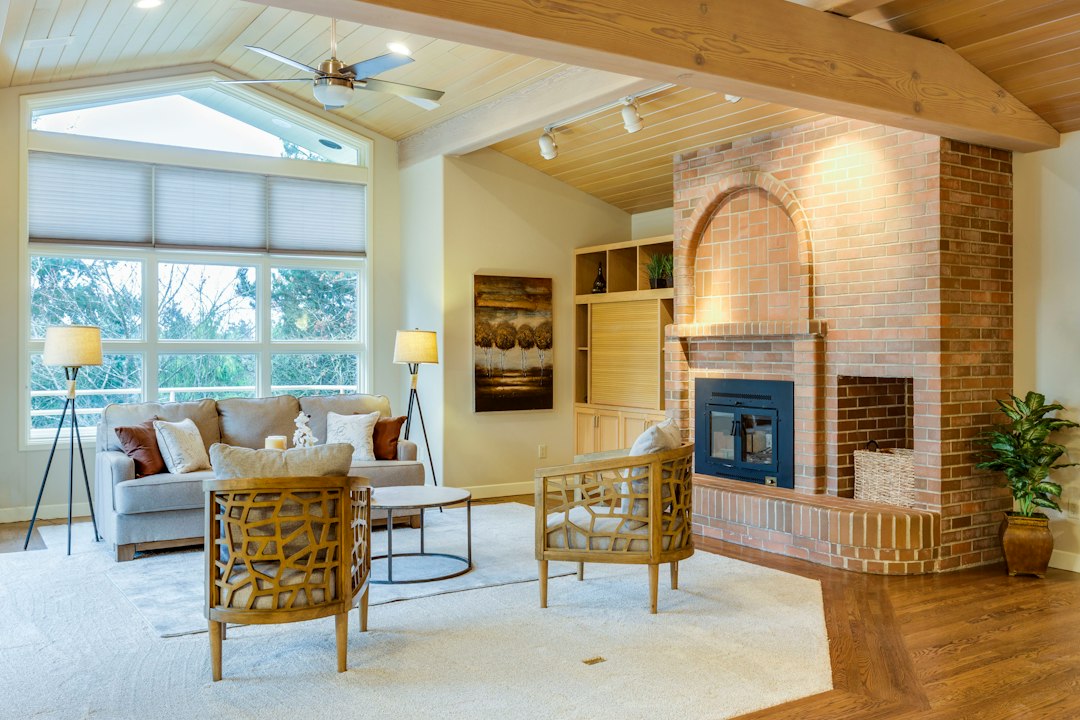
Most small-space advice tells you to keep things small — small furniture, small art, small fixtures. Scale everything down to match the room, the thinking goes, and the space will feel more manageable. Designers who work in genuinely constrained square footage know that’s backwards. The advice sounds logical until you live with it, and then your 400-square-foot apartment looks like a dollhouse.
The counterintuitive rule: go oversized with art. One large piece — or a closely grouped arrangement that reads as a single visual unit — does more to expand a cramped room than a dozen small prints ever will.
Why Small Art Makes Small Rooms Smaller
Here’s the mechanism. When you hang a 10” x 12” print on a wall with 18 inches of empty drywall on every side, the eye reads three distinct things: the print, the wall above the print, and the wall below it. You’ve effectively chopped the surface into fragments, which makes the viewer aware of all that unused, slightly awkward space. That awareness signals: this wall is small, this room is small, I notice its boundaries.
A piece (or grouped arrangement) that fills roughly 60–75% of a wall’s width works differently. The eye moves across it and the wall resolves into one coherent plane. The boundaries of the art become the perceived boundary of that part of the room, not the actual drywall edges. Less visual noise. More apparent depth.
Interior designers sometimes call this the “anchor” effect. The wall is anchored to a single element, and the room feels grounded rather than scattered. Scattered reads as small. Grounded reads as intentional — which the brain interprets as spacious.
The Proportions That Actually Work
This isn’t about buying the biggest canvas you can physically carry through the door. There’s a more useful formula that avoids the opposite error — art so enormous it feels aggressive.
For a sofa wall or the primary wall of a living space, a single piece should span roughly two-thirds to three-quarters of the furniture width below it, or two-thirds of the wall itself if there’s no furniture anchor. A 72” sofa pairs well with a piece that’s 46–54” wide. A blank 10-foot wall can hold a canvas or framed print in the range of 60–80” wide. Measure the wall before you buy anything. (Before trusting any floor plan app’s dimensions on this, run a laser measure yourself — the difference between 9’ and 10’2” changes which sizes look right.)
Height placement matters too. The common instruction is to hang the center of the piece at approximately 57–60” from the floor, which is roughly eye level for a standing adult. In a low-ceilinged room — under 8 feet — going a couple inches lower can actually help by pulling the eye across the room horizontally rather than emphasizing the ceiling’s proximity. In a room with higher ceilings, centering slightly above 60” allows the piece to breathe upward.
Grouped Arrangements: When a Single Piece Isn’t the Answer
Not every wall is suited to a single large canvas, and not every budget can stretch to large original or print work in one shot. Gallery walls can accomplish the same spatial trick — but only when they’re configured to read as one unit rather than a patchwork.
The rules for that:
- Keep internal spacing tight. Two to three inches between frames reads as intentional clustering. Four or more inches starts to fragment, and the eye sees individual pieces again rather than a mass.
- Maintain consistent framing or matting. A mix of natural wood, black metal, and ornate gold frames makes the eye work harder to find coherence. Same frame finish, or a deliberate palette of two that are close in tone, lets the arrangement unify.
- Sketch it on the floor first. Lay all the pieces out on the floor in the arrangement you’re considering, then measure the outer footprint of the arrangement. That rectangle is what you’re hanging. It should hit the same proportional targets as a single piece.
- Avoid the “postage stamp” corners. Don’t let a single small piece anchor the upper left of an arrangement with nothing filling toward center. The mass should feel dense and intentional in the middle and taper only slightly at edges.
A gallery wall done this way can cover a significant wall section without a single expensive large-format piece. It also lets you incorporate existing prints, photographs, or even objects — small mirrors work well in a gallery mix and add light reflection on top of the spatial effect.
Color and Subject Matter: Not Just an Aesthetic Question
The color palette of your art affects the same spatial illusion. Pieces with high contrast — especially a dark figure against a light ground, or vice versa — advance toward the viewer more aggressively. In a narrow room or a hallway, that can make the wall feel closer. A piece with softer transitions or a palette that coordinates with the wall color (without being invisible on it) tends to feel like it recedes slightly, which extends perceived depth.
This is worth considering when you’re also navigating paint color. A dark kitchen that reads twice as big often achieves that effect partly because the contrast between surfaces is controlled — the same logic applies to what you hang on those surfaces.
Subject matter with clear horizon lines or deep perspective — a landscape with a vanishing point, an architectural photo with strong linear recession — tends to enhance depth perception in the room. Abstract work with chaotic surface texture can read as energetic but does less spatial heavy lifting.
Lighting the Art, Because That Changes Everything
A large-format piece in a dark corner reads as a dark rectangle. All the proportional math above depends on the piece actually being visible and completing the wall rather than becoming a void.
Track lighting or a picture light mounted directly to the frame both work. Track lighting aimed at the piece with a beam angle of around 30 degrees is a reasonable starting point — narrow enough to focus on the art, wide enough not to create a spotlight effect that cuts off at the edges. Clip-on or add-on lighting options are worth considering if you’re renting or don’t want to commit to fixed track positions; some picture-specific clip-on lights are LED and draw minimal power while still throwing enough lumens to read clearly in a dim room.
The goal is even illumination across the piece — no hot center, no shadowed corners. That even wash makes the piece feel like a complete plane, which is exactly what the spatial trick requires.
The Move: Start With Your Largest Blank Wall
Pick the wall in your smallest room that has the least architectural interruption — no windows, no doorways cutting in. Measure its width. Multiply by 0.65 and 0.75 to get your target range. Then look at that range and decide whether you’re sourcing a single piece or building a grouped arrangement to hit those outer dimensions.
If you want to test the proportions before committing, tape out a rectangle on the wall in painter’s tape using your target dimensions. Live with it for a day. It sounds low-tech, and it is — it also reliably shows you whether the scale reads right in the actual light of the actual room before you’ve spent anything.
That test takes ten minutes and costs nothing. Do that before the canvas.